
How to Write Texts for a Website
Unlike printed text, on the internet information is mostly scanned, searching for what is of interest or the answer to a question. The time available to decide whether to click a link is extremely short. Even when an article is opened, the visitor first visually scans it and only then decides - is it worth reading or not. There are a few tricks to presenting text on a website so that visitors notice it.
Unlike printed text, on the internet information is mostly scanned, searching for what is of interest or the answer to a question. The time available to decide whether to click a link is extremely short. Even when an article is opened, the visitor first visually scans it and only then decides - is it worth reading or not. There are a few tricks to presenting text on a website so that visitors notice it.
For the second year running, on 26 February 2015 in Riga an impressively attended one-day conference took place - UX Riga. As the name suggests, the main conference topic is website usability, or in English - User Experience, or UX.
The previous year brought the feeling that "the world" had finally come to Riga to announce that a web page is meant for the visitor. The conference seemed considerably more packed with practical tips, features and tricks. This year the conference turned out somewhat more "airy" and out of all UX aspects, the emphasis was placed on context. That is, what and how much to show under various conditions - for example, to desktop or mobile users, whether the page is viewed during the day or at night, on a weekday or weekend, etc.
However thoughtfully a page is built in terms of navigation and design, the main thing is content. Or as the workshop "Writing for Web 101" lecturer Līga Lētiņa (CUBE Systems) put it:
Content is king of the page.
How to Write Engaging Texts for a Website?
The good news is that how to write "correctly" for a website is scientifically researched and grounded. Essentially, statistical data have been analysed gathered from studying individual visitor behaviour patterns. Moreover, special tools exist that can be embedded in a website and gather information such as - where the mouse cursor is, which links are clicked, how far the scroll bar is moved, etc. By collating this, conclusions can be drawn about what works on the page and what does not.
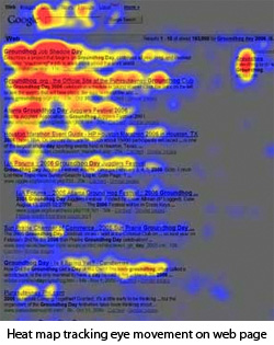
The bad news is that on the internet, texts are mostly not read but in 79% of cases scanned - searching for keywords and anchors of interest. This is related both to the enormous volume of information and to the fact that unlike printed text, a monitor emits light, meaning that objectively the eye can concentrate for a considerably shorter time.
A single website receives approximately 25 seconds of attention.
From visitor behaviour patterns it follows that information is scanned in an "F" shape. The headline is read, the beginning of each paragraph, subheadings, etc. An equally interesting observation is that after reading the top of a document, visitors often scroll to the bottom. This behaviour pattern was probably imposed by "classic" web pages, as for example e-shops have related products at the bottom, and news portals have comments. From this it follows that if the content seemed interesting to a visitor, they look for where to click next.
How Long Should a Text Be?
- 55 characters in the headline
- 5–6 paragraphs
- 4 lines per paragraph
The principle of text construction also differs. At the start there should be a summary, then supplementary information, then history, links and data. Unlike printed texts, dividing text into columns and justifying it on both sides is not recommended for websites.
An interesting recommendation was put forward:
If you write a text for a website, once written, cut it in half.
Information Perception
For information to be more easily perceived and thus hold the visitor's attention longer, it is useful to structure the information - use numbered lists, tables, quotations. Text written in a "We - You" format will also help retain attention.
It is important to remember that when searching for information of interest, a visitor unconsciously narrows their perception, concentrating attention on specific keywords. Essentially having a rough sense of what the expected information should be.
Keywords and Professional Jargon
To a large extent, whether or not professional jargon is used depends on who the website is intended for. An example given was the misplaced use of the formally correct term "pre-school educational establishment", when most visitors would search for it as "kindergarten". The same applies to navigation links. For example, a red button labelled "my cadastral data" is not always perceived as a link to "my properties".
Of course, these recommendations from the lecturer are to be taken as thought-provoking reflections rather than universal recipes that will suit everything. It is important to be aware of who the visitor is and what their interests are.
Conference materials will be available here - http://www.uxriga.lv after 12 March.
In the meantime, feel free to look at presentation slides on this topic - http://www.slideshare.net/kmjgardiner/writing-for-the-web-presentation-725277
comments